Our Client
Great Ormond Street Hospital (GOSH) explores the future of medicine in its innovative DRIVE unit that strives to push the boundaries of conventional clinical practice through experimentation with artificial intelligence and cutting-edge technologies. Its mission is not only to discover the new, but to re-invent the ordinary. It means completely transforming patient experience and most importantly making people believe in what can be achieved.
 Project Background
Our team undertook this project with the goal to create a whole new experience for medical students and trainees. Teaching and training in medicine is currently restricted to the conventional textbook memorizing and observing procedures performed by experienced specialists. Because of the complicated nature of the subject, however, it is often the case that this simply insufficient.
This is why Mixed Reality (MR) has plenty to offer - it has the potential to revolutionize this learning path with its dynamic three-dimensional content and yet to explore capabilities. Our team aims to make these first steps by creating a HoloLens application that would assist clinicians by presenting relevant information with interactive approach. Such real-time assistance on heads up display, first of its kind to be used in practice, will improve significantly their work since their hands would be free to perform necessary tasks, and furthermore they would have instant access to the information needed. This big project started by MSc students will be developed and refined further in time to create the ultimate experience for professionals working in a medical environment.
 Project Goals
What our team aims to achieve at this stage is not only implementing the core MR design principles to create something entirely new and unique but to give users a sense of control and comfort altogether.
Focus is on user experience (UX), which needs to enhance functionality previously implemented in a static environment that makes it practically unusable in a fast-paced clinical setting.
By using Unity’s 3D environment and taking advantage of the open-source HoloToolkit, we are to create an application for Microsoft HoloLens that processes speech in real-time, reads JSON files to display information and makes use of all the opportunities the headset technology has to offer.
Requirements Gathering and Agreed Final Requirements
To guide our project in the right direction and meet the client’s expectations, our team did a thorough gathering of requirements, executed at two stages – before and after research and prototype design were done. At the first client meeting we gained an insight into the general idea behind the project, its background, and also the aspirations the client has for its further development. We received instructions on what the team should focus on, namely creating such interface that users would quickly and effortlessly adapt to and be comfortable to work with. Moreover, the discussion further clarified that a crucial part of the project is the implementation of data extracted from a JSON file.
Because our project originally demanded development for the Vusix glasses too, we discussed the issue with the module supervisors. We concluded that due to the time constraints and the big technical differences between the two platforms, it is unreasonably put as a requirement, especially because the client clearly stated that a more sophisticated app on one platform is preferred over the case of having two overly simplified versions.
Second Client Meeting
With the second meeting we intended to confirm we are on the right path and to further refine the requirements. The client discussed in more detail some of the additional features wanted such as the JSON file having a FIHR format to make the development of future releases easier and creating a configurable main view file so that users would be able to change the design as wanted without the need of a HoloLens specialist to code the change. As we further researched the topic, it became clear that implementing the FHIR resources is not applicable at this stage of development due to its complexity – this conclusion we agreed upon with the client over an additional video conference.
Difference between Client and UCL requirements
A fundamental part in organising the requirements list was considering the slight difference in our clients’ and supervisors’ expectations that became apparent after these discussions – the former putting the focus on the user experience and the latter requiring solid functionality. When creating the initial sketches and prototype design we strived to achieve exactly this balance.
Back-End Requirement
Although the back-end was originally intended to implement cTAKES, after experimentation the team concluded that its complexity is not suitable for this project and researched alternatives. Lexigram was chosen as a significantly better option that offers the functionality we need but comes with a reasonable complexity. It has all the implementations we need and just provides simple end-points that are called only when medical extraction is needed.
Personas
We made two user personas to better illustrate and understand the specific needs and uses of our project. We then composed a scenario based on each persona and the feedback we got from our client regarding who will use the project which was junior doctors and potentially fully trained doctors i.e consultants.
Junior Doctor, in training
Dr Smith is a 25-year-old junior doctor currently working at GOSH (Great Ormond Street Hospital). He is still learning and shadowing a senior doctor while working at GOSH, always hearing and processing new terms. While being with a patient he often cannot use a note pad to write down what the senior doctor is saying and has to remember to take notes later. This interferes with his learning process. The AR project would help him to learn while being present and interacting with patients. When listening to the senior doctor speak, rather than having to remember complex terms or interrupt the doctor, he could make use of the AR headset to learn in real time the terms he does not understand.
Trained Doctor/Consultant

Dr Cooper is a 40-year-old consultant at GOSH. During a busy ward walk, she visits many patients and interacts with each one. This process is quite time consuming. She wishes to make this process more efficient to save vital time she could be using elsewhere, perhaps through the use of technology. By utilising AR, Dr Cooper could quickly skim patient information, such as diagnosis, medicine dosage etc. speeding up the interaction time needed with the patient.
Storyboards
First Scenario
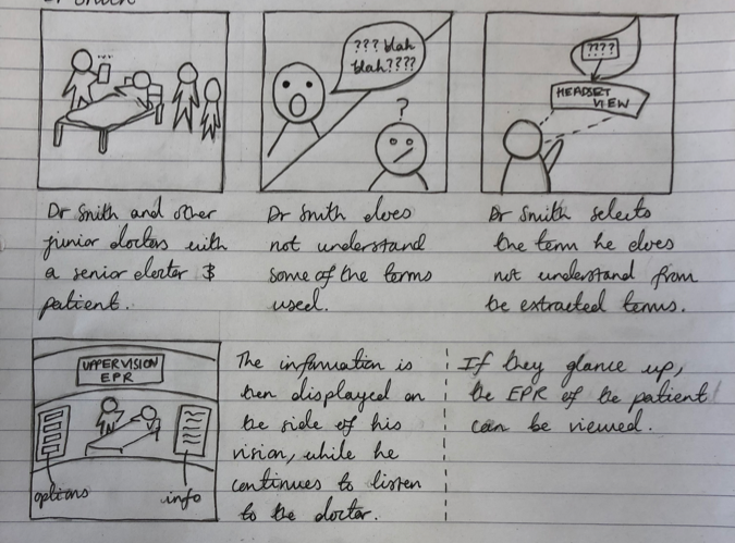
As the doctor speaks, the AR headset being worn by Dr Smith begins picking up the medical terms he says. If Dr Smith does not recognise a specific term he selects it and the device processes the term and displays a definition in his direct Field of View (FOV) while in his secondary view associated terms are displayed. If the term is a medicine, it may also produce the SNOWMED code on his left side which is viewed via a slight left head movement. In his direct FOV the definition is displayed to one side, to help maintain focus on the patient. Upon reading the definition, Dr Smith understands the term and thus the conversation is clearer. Throughout the interaction the headset continues to do this with each medical term. He can also glance up via slight upwards head movement to view the EPR of the patient if desired.
Second Scenario
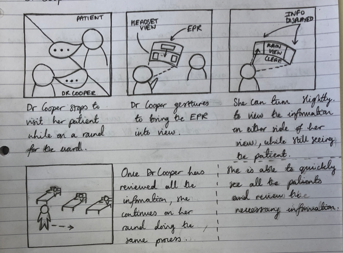
While talking to the patient, the AR device uses facial recognition on the patient to bring his EPR in the doctor’s immediate view. Briefly Dr Cooper scans the document and then does a swipe gesture to remove it from his immediate FOV. She turns slightly to the left where she sees the medicines the patient is on and their doses. This allows her to quickly understand the current state of the patient and the next actions to take, rather than spending several more minutes discussing with the patient and nurses. She asks the patient about his symptoms and the AR device brings in her FOV some related symptoms which might be developed in the future.
Functional & Non-Functional Requirements
Functional
| Functional Requirement | Description |
|---|---|
| View of Data | Data viewed without distracting user from patient. |
| Type of Data Displayed | The purpose of this applciation is for medical students and trainees, therefor it must be relevent to this. |
| Interaction | Have form of interaction with user i.e. user can select text/image/graph. Also able to use gestures and voice commands to achieve this. |
| Location of Information | Show information in direct Field Of View (FOV). Must also utilise depth of field such primary and secondary FOV. |
| Design | Easy on the eyes colour schemes suitable for use in the medical field. |
| Data Inspection | Data can be further inspected upon selection. |
| Data displayed | Information could be displayed in the form of graphs that are laid out in perspective or using 3D models. | Utilising Environment | Use surroundings to show data based on environment of user. | Facial Recognition | Utilise this to display records of patients. | Configuration | Have customisable / user specific displays. |
Non-Functional
| Non-Functional Requirement | Description |
|---|---|
| Data Extraction | Using external data from a JSON file, and then importing this into the Hololens. |
| Real-Time Data | Display medical information from real-time data i.e. Lexigram: the natural language processing API will be used for real-time terminology extraction. |
These tables detail all the requirements our project entails, splitting them into functional (a function of the system) and non-functional (how the system will operate).
MoSCoW Requirements Requirement List
Must Have
- 1.
Data viewed without distracting user from patient: information needs to be subtly integrated into the view preventing any potential discomfort such as objects placed in front of people.
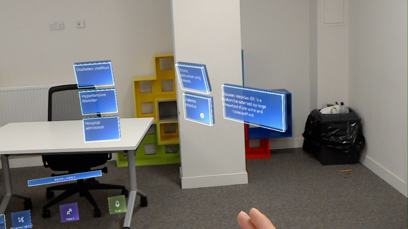
In order to achieve this, we made sure to follow the principles of AR Design, which states various design notions to ensure navigation and use it as comfortable as possible for users. Specifically, we use translucent colours, with bright, easy to read text, and kept any visuals within 1.25 to 5m as per the Microsoft guidelines, while also not placing them too high or too low to avoid neck strain. To ensure the UI was subtle, we used simple colours on translucent objects which blend well into the natural environment. Moreover, the UI has been kept simple so that it does not consume the entirety of the user’s field of view.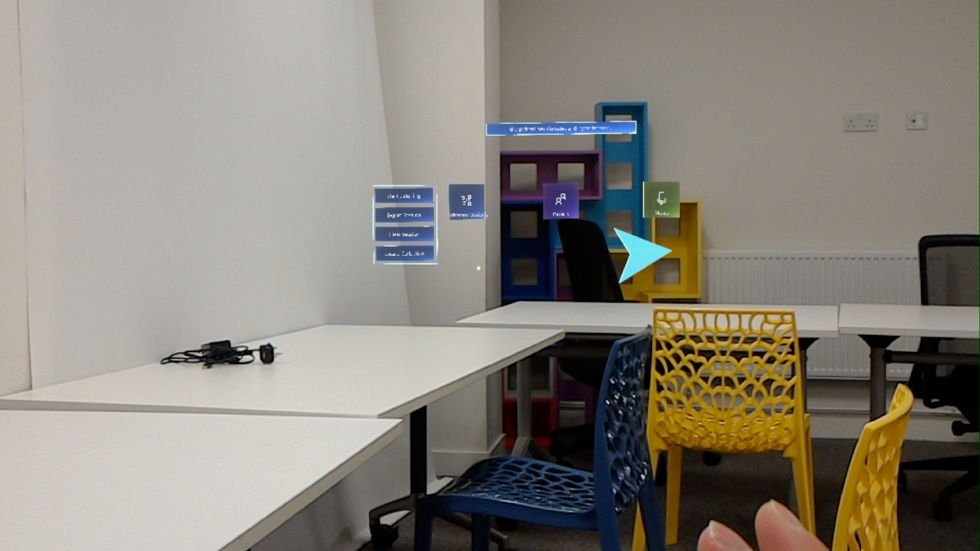
- 2.
Show output from JSON file to MR device: the information displayed will use external sources of data. To achieve this, we wrote a script which reads a JSON file and then outputs that into a text box within the Hololens. Specifically, this text is the patient information displayed on the patient record. Moreover, the data gathered from the medical data API is also presented in a JSON format and we also have a script which reads this information and presents that within our dictionary scene. This data can be exported at the end of a session.
- 3.
Show medical related data on AR device: the application is intended to help medical students and trainees exceed in their studies thus the data should represent an abundant textual and visual resource for terminology.
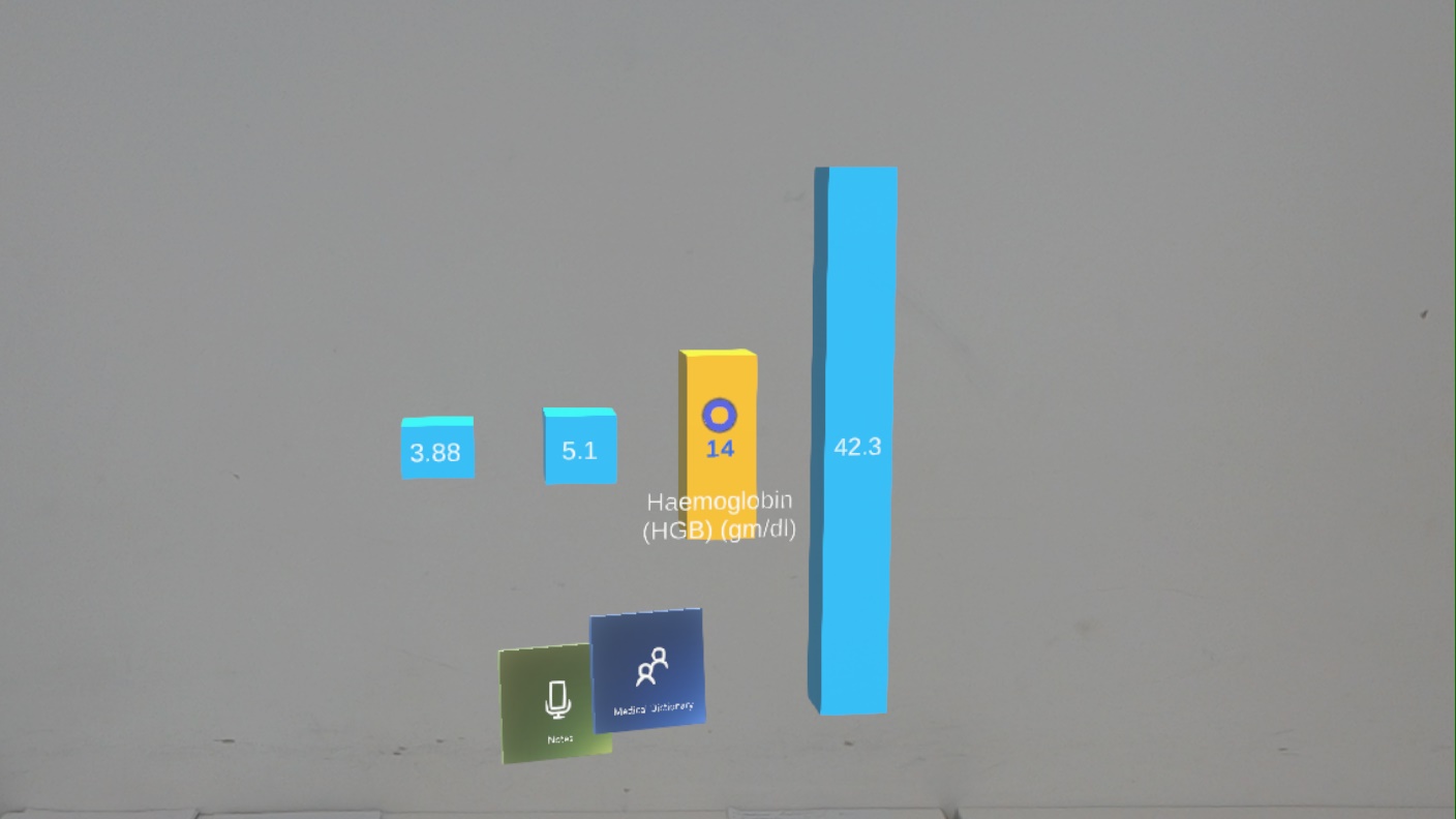
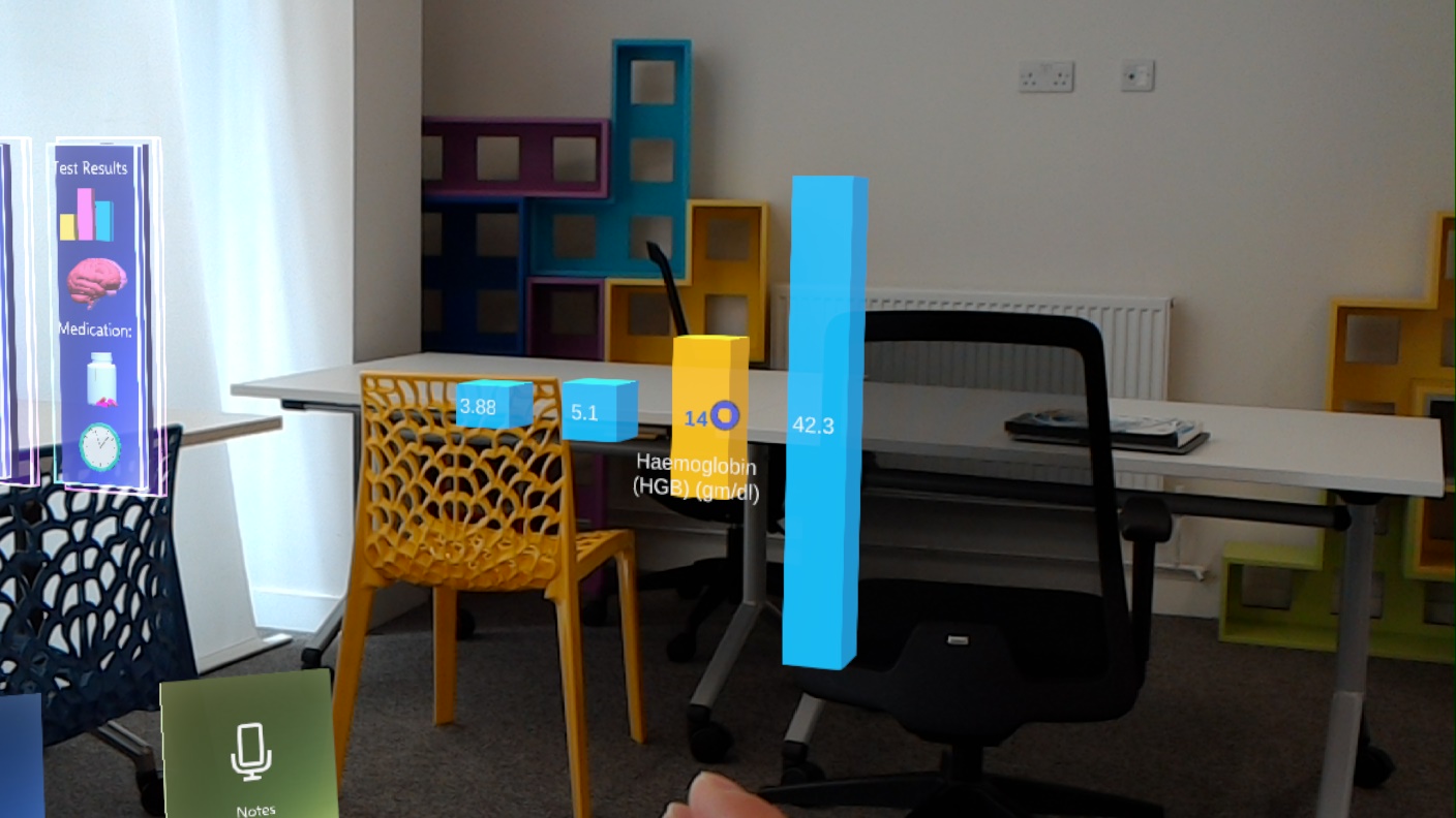
We created a graph which can have any data input into it via the attached script. The graph can then be manipulated using hand gestures and voice control within the Hololens so that it can be further analysed.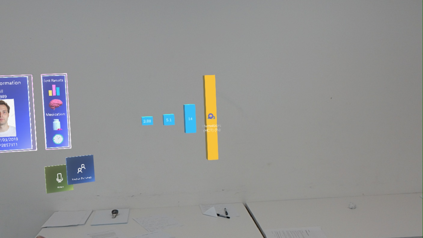
- 4.
Have form of interaction with user i.e. user can select text/image/graph: the UI’s elements would be designed to be responsive to action and properly navigate the user for the ultimate experience.
Every object within our application has its associated form of interactive script attached. For example, a button can be selected using hand gestures and also selected using voice command; a graph can be manipulated using two handed gestures and also voice commands. This allows users the freedom to interact in the way which is most convenient within their current environment, something which is highly convenient in a fast changing hospital setting. - 5.
Show information in direct Field Of View (FOV): users should be able to effortlessly take full advantage of the experience which could be fulfilled only when the essentials are within reach and at the same time noticeable at every stage of the interaction.
We made sure all integral components are at the forefront of the UI so that they are clear and easy to navigate, while less-integral components are set in the peripheral. As mentioned above, we made sure to utilise design principles to ensure all components were placed within a suitable area in the field of view. - 6.
Easy on the eyes colour schemes suitable for use in the medical field: because visual perception strongly affects the overall user experience, the UI elements will implement all the good design practices recommended by professionals and at the same time comply with the client’s logo colour scheme.
As mentioned above, we made sure to use dim, holographic and basic colours which are most suitable for a medical environment. Moreover, the UI is very simple making it effective for easy navigation. As a result, the UI transitions seamlessly into the background environment, making it easy for the user to navigate while also engaging. - 7.
User Interface must be of high-quality and high-resolution to look polished.
To ensure this was achieved, we utilised materials, objects and design practices of the Microsoft Mixed Reality ToolKit and the Microsoft Design Academy. Specifically, we used holographic materials located in the ToolKit so the UI looked polished while keeping the design simple, so it is sophisticated. Moreover, the use of the available icons ensures the design is professional and self-explanatory. -
Percentage Completion: 100%.
Should Have
- 1.
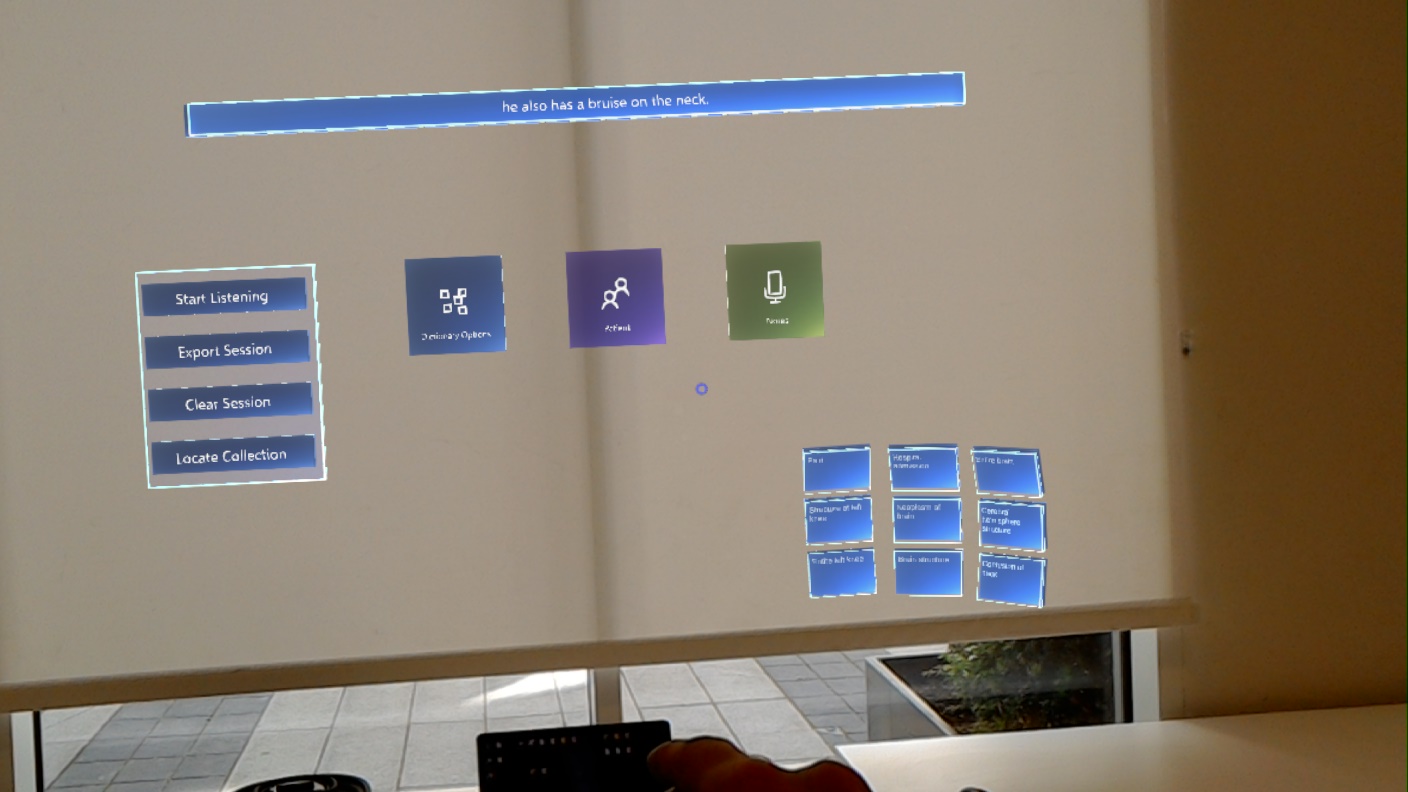
Display medical information in direct FOV from real-time data i.e. Lexigram: the natural language processing API will be used to build a reliable dictionary-based and real-time terminology extraction to support consultations and dialogs that need clarification. To achieve this, we implemented the dictation recogniser from the Mixed Reality ToolKit. The text from this is then sent to Lexigram which extracts the medical terms. After this, we implemented a Wikipedia API (MediaWiki) which took the extracted terms and then displayed the information regarding that term into a box for users to view. On top of this, the ‘notes’ scene utilises dictation to allow users to verbally input any information onto notes in real time.
- 2.
User must be able to select information for further examination: dynamic content needs to be present to create a sense of engagement with the application. To achieve this, we simply created layers to our application. All the information available is not presented all at once, as this would simply be too cluttered. A user must select the appropriate buttons or say commands for certain information to appear. This allows users to only view what is necessary when they need to, rather than all the time. For example, the user can say a command to make the patient record appear. On top of this, the patient record has other components too it which also need to be selected to be shown such as a graph.
- 3.
Show primary information in primary FOV (no neck movement just in front of user’s eyes): all important functionality needs to be easily accessible throughout usage and so located at expected places. As previously mentioned, we ensured the positioning of integral components remained in the primary field of view. We also ensured navigation was always possible by providing back buttons. Additionally, we felt it was important for this information to always be easily accessible, without leaving the users main FOV. To achieve this, we utilised the tag-along feature of the Hololens. This allowed us to tailor the UI so that a user could look up or down to view other information, but when returning to normal gaze the UI would still be there. They could also move about completely i.e. turn around and the UI would follow to remain in the primary FOV.
- 4.
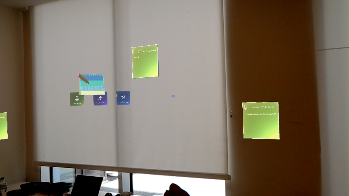
Show secondary information in secondary FOV (neck movement): all additional data should be placed on the side to reduce cluttering and be properly indicated so that the user is guided to perform actions with confidence. In order to achieve this, we continuously refactored and reconsidered our design to ensure only integral parts of the UI were present in the main FOV. Our main utilisation of the secondary FOV is within the ‘Notes’ Scene. This allows users to ‘pin’ notes onto specific areas of a room, and when the user looks away, they remain there and thus become part of the secondary field of view.
- 5.
Have main view file which is configurable to change how everything looks i.e presets: users need to feel in control of their mixed reality experience which can be achieved by providing them with the freedom to choose the design characteristics of elements.
-
Percentage Completion: 80%.
Could Have
- 1.
Translate some medical data to 3D so user can interact with it more: information could be displayed in the form of graphs that are laid out in perspective or using 3D models. We implemented this in the form of a graph. The graph is created using a script with values input into it. The graph utilises 3D shapes and can be manipulated using gestures and voice commands as desired.
- 2.
Use hand gestures to examine data i.e. graphs in space in front of user: elements need to be interactable and implementing HoloLens’s gesture functionality that sets it apart from other technologies that could have been used (such as a more traditional device). The Mixed Reality ToolKit comes with built in features which allow for object manipulation. This includes, enlarging, shrinking, rotating and moving. We, of course, then implemented these features by attaching them to the appropriate objects. Specifically, the ‘notes’ can be moved and anchored to a position using hand gestures, while the graphs can be rotated or scaled to different sizes using one or two-handed manipulation.
- 3.
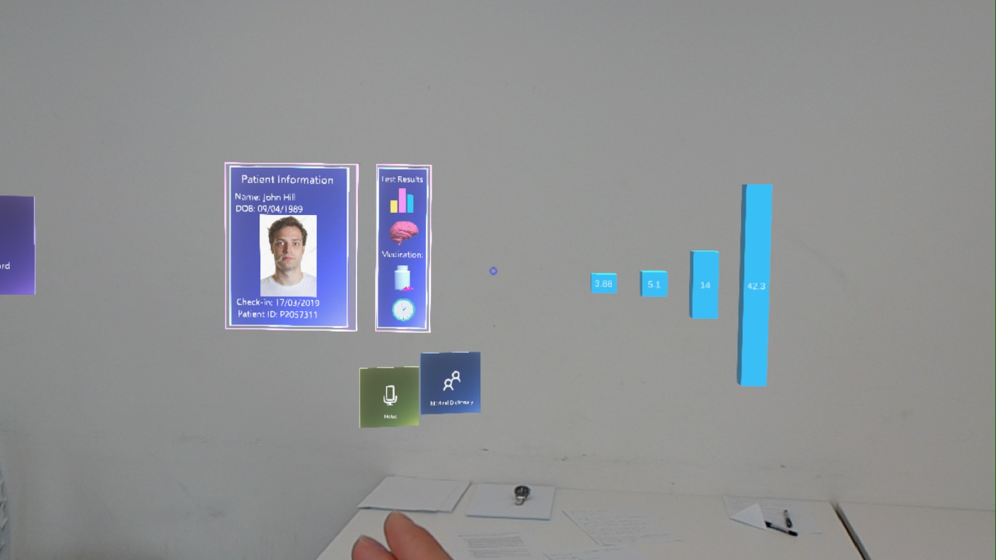
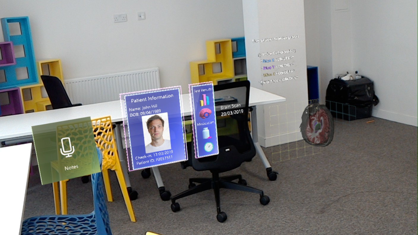
Non-primary data show in a different depth than primary data/important: the sense of dimensions would be reinforced by using different distances for object positioning that still follow guidelines for comfortable lengths. Within the main UI is the primary data. Upon selection, other data appears in the peripheral view. For example, when the patient record is select data appears to the side of this, rather than on top and centred. Aside from this, we also utilised depth i.e. objects are at various distances from the user. This has been implemented within the ‘notes’ scene as the position of notes is based on the part of the spatial mapping they are attached to. Spatial mapping utilises depth in order to place objects in a specific area of a real-world environment.
- 4.
Use surroundings to show data based on environment of user: the app could show in action one of the greatest strengths of HoloLens namely Spatial Mapping and Spatial Understanding that enables the user to interact with its environment, which comprises true mixed reality. Our main utilisation of the spatial mapping capabilities of the Hololens is within the ‘notes’ page. Within this page the spatial mapping recognises the various surfaces, specifically walls, of the environment it is being used in. Then, we were able to combine this with physical objects so that they could be attached to the surfaces.
-
Percentage Completion: 75%.
Would Have
- 1.
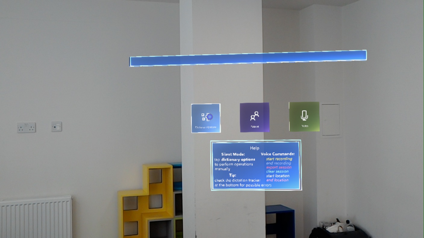
Use voice control to bring required information from backend and display it suitably in AR: the app might use HoloLens’s voice control to navigate through it and access information since quite often clinicians need their hands to be free while performing tasks. While the Hololens comes with some built in voice controls such as ‘Select’, these are fairly limited and not very specific. As a result, we implemented our own and attached them to objects for various forms of manipulation and navigation. Specifically, this involved the use of the ‘KeywordRecognizer’ which executes functions within scripts upon ‘hearing’ a keyword. As a result, we are able to manipulate objects and also navigate the project.
- 2.
Use face recognition to display a patients Electronic Patient Record (EPR): in the future the system could possibly be optimized to use alternative ways of accessing records.
- 3.
Have different view configurations for different patients: with further development the application could be diversified to suit different people’s preferences.
-
Percentage Completion: 33.3%.
Sample Use Cases
- 1.
User needs a definition for a medical term: the application needs to be prepared for processing data which is achieved by navigating to the “Dictionary” page from the main menu and the recording button should be pressed and indicating recording is carried out; then terms would be extracted based on the recorded conversation and displayed as a scrollable menu; to access the definition of the term the user needs to simply press the respective button.
- 2.
User wishes to view more info available on the patient record: this can be done by selecting the record. Various pieces of information can be hovered on to reveal more.
- 3.
User wishes to manipulate the graph of their patients historic test results to further inspect the data: They can do this by using the appropriate voice commands detailed on the page.
- 4.
User wants to go back from looking up a definition/diagram: the user needs to simply press the close button.
- 5.
User wants to access a patient record: it can be done from the main menu by pressing the “Patient Record” button and then navigating to the desired record.
- 6.
User wants to use voice control while navigating the application within the hospital as they do not have their hands free: they simply need to glance at the panel which details the voice commands and then say it aloud.
- 7.
User needs to leave the patient record and visit the dictionary page: there is a back button provided in every page that takes the user to the main menu, by selecting it they can navigate back.
- 7.
User needs to leave the patient record and visit the dictionary page: there are buttons located in every page that takes the user to the page they desire, by selecting it they can navigate to the page they wish. While the user is on patient record page, the dictionary button will be present. They simple need to select this to navigate there.
- 8.
User wishes to end current session: User must select or use the appropriate voice command “clear session”.
- 9.
User wishes to save content from todays round: At the end of the session they simply need to select the “export session” button.
- 10.
User wishes to leave a note regarding a patient and pin it to their room: They must visit the notes page, select or use voice command and then say what they wish to be input onto the note. It can then be interacted with and placed in the desired location.