The design process was navigated by the ultimate goal of achieving balance between two forces:
The drive to be innovative in a field without many set standards when it comes to user interface
The need to provide reasonable access to functionality that is still within the user’s comfort zone
Our HCI Report
The first stage of this process was dedicated to the Human-Computer Interaction (HCI), as a field of research, and the initial brainstorming of presentation conceptions for the different types of components. These first steps in the development were captured thoroughly in the following HCI presentation outlining our design principles, user research, paper sketches, as well as our first wireframes, which laid the foundation for the UI we have now.
Design Principles
To get to grips with designing for the Hololens, we studied the guidance offered by the Microsoft Mixed Reality page in the Dev Centre (1. Docs.microsoft.com, 2019). This covered the fundamentals of MR app development, introduced us to all the features that can be used for a better interaction and at the same time all the limitations that needed consideration.
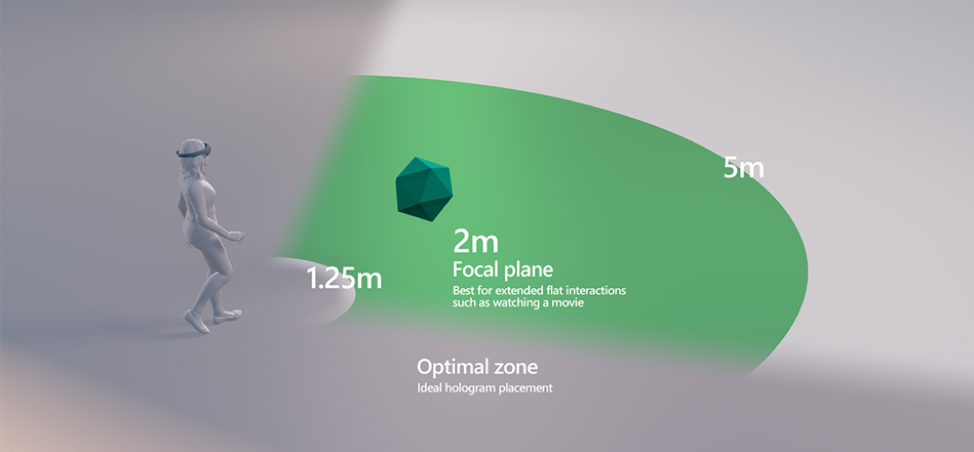
Field of View
The image below (2. Docs.microsoft.com, 2019) depicts the optimal zone for hologram placement in the range between 1.25m and 5m, where interaction is carried out with maximum comfort. As a result, we have implemented all features accordingly, with most of the UI placed around 2m, and an option to adjust further the depth by dragging the object.
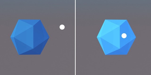
Gaze
When it comes to Mixed Reality, gaze targeting is one of the fundamental forms of interaction, which is also the most natural and comfortable one. Thus, objects need to be at the right height and have the right size, in order to be completely accessible by users. Hololens also includes many features to ensure gaze targeting is as simple as possible, such as: Gaze Stabilisation, Smoothing, Focus Stickiness and Magnetism. (3. Docs.microsoft.com, 2019)
According to the Microsoft Mixed Reality Academy:
Gaze tells you where the user is looking in the world and lets you determine their intent. In the real world, you'll typically look at an object that you intend to interact with. This is the same with gaze.
Voice Commands
While gestures are the way to go when the user prefers a more conventional kind of navigation throughout the Mixed Reality app, such as the Air Tap for clicking, design based on voice control offers something more. Namely, the unique chance not only to completely free the user’s hands, which will allow them to perform other activities in parallel, but also to give them the sense of an interaction that feels a little closer to the human one. However, to achieve best results, the guide advises to use concise commands and reduce the complexity of the vocabulary to be used.
The user needs to be informed at all times of the possible commands as it is still not intuitive for people to use this form of navigation. This should be reflected in the UI.
Buttons
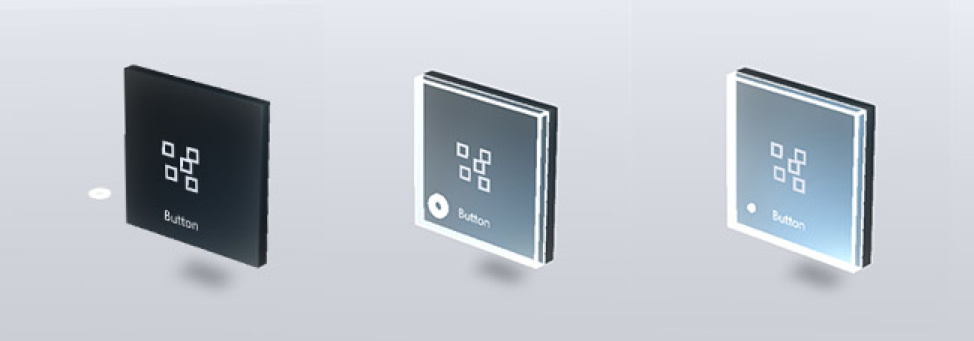
In terms of the user interface, there are also aesthetic design principles to consider. We incorporated such principles when designing all of our buttons. For example, when a user interacts with a button, it is important that they receive visual feedback that they:
a) hovered over and then b) selected it
The image below shows the 3 states of a button: observed, targeted and pressed. (4.Docs.microsoft.com, 2019)
Another important aspect we considered was how different objects will appear within the HoloLens compared to our PCs. The Hololens render images differently from a flat screen, using color-sequential, see-through RGB displays to render holograms. As a result, we made sure to experiment with colours and materials to see how they rendered within the MR environment and how they were viewed by the user.
Spatial Understanding
One of the best advantages of Mixed Reality compared to all the other kinds of application environments is the fact that it is actually the real world. This aspect makes it unique. The ability to pin objects on surfaces around you is the perfect way to save information where it is needed, therefore we aimed to utilise it in our application. A number of factors such as user motion, surface materials and lighting interference, that could cause possible discomfort needed careful consideration. (5.Docs.microsoft.com, 2019)
Design Planning
The initial sketches, wireframes and prototypes outlined the main functionality of the application and how it would look. The design research and user testing that followed, however, revealed the yet unnoticed issues:
1) having UI in the secondary field of view is not a good practise as it is hard to locate – contradicting the initial idea of moving the medical terms and explanations generated in the Dictionary scene in the peripheral
2) scrolling of 3D objects is both hard to implement and hard to execute
3) buttons need to be self-explanatory and any action related to them needs to be intuitive – this was drawn as a conclusion both from the research and user testing
4) the need to guide the user throughout his whole experience as the format is too different and not as “intuitive”
5) explanations should be separated from diagrams but two buttons for each term is not efficient design solution in functional and aesthetic aspects
Iterations
While focusing on the main functionality tended to be a priority during the first half of the project, our client put a strong emphasis on user interface and requested additional features that would demonstrate the capabilities and potential of MR:
- graph presentation in space, using an external source of data
- note taking and sharing
- export option for the Medical Dictionary sessions
- example of a 3D model, e.g. a scan
- utilisation of spatial understanding
After re-evaluation of the additional requirements, the team focused on developing the new conception, having in mind that all the required functionality and UI need to be implemented in a structured and logical way.
Organisation of Scenes
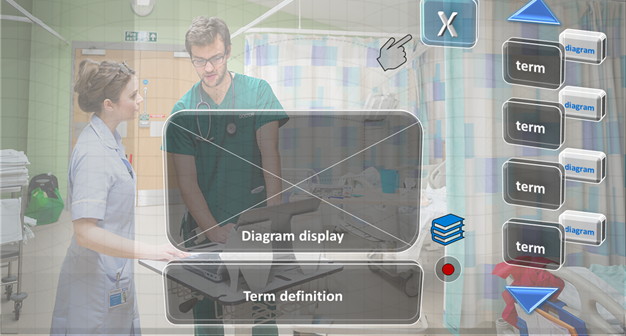
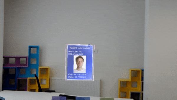
We introduced separation of functionality into three scenes: initial menu, medical dictionary and example scene. Experimentation with 3D models in the example scene proved that it needed a better way of organising the components. Thus, it was transformed into a medical record, while the note taking functionality was moved in a separate scene. A help section was considered too but its isolation in another scene would not have been the best way to offer guidance, so we incorporated hints in every scene.
Final Design
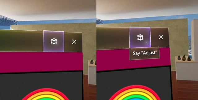
Voice Control
When we had the right structure for the application, the priority shifted on enhancing the quality of the separate scenes. At that stage, after additional functionality had to be included, buttons were the only means of navigation, which made the view cluttered and closely resembling the familiar 2D apps. To break away from this tendency, full support of voice control had to be integrated.
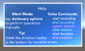
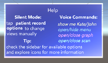
However, bearing in mind the application’s use cases and intended environment, it was clear that operations could not simply rely on one or another, but had to offer both a “silent mode” using gaze and air tapping, and voice control that makes use of concise commands. The former was implemented in a manner of “unfolding” - looking at an object/clicking a component reveals further information in order to declutter the view, while the latter introduced hints on the available speech-driven actions in every scene.
Navigation
Instead of having to return to the main menu in the initial scene every time when the user wants access to another feature, we simplified navigation by integrating the menu in every scene, just below the main field of view. This way, first – it does not interfere with any of the content, and second – it is just within reach. Further optimisation was achieved with the decision to stick to the original three-buttoned menu but having two of them leading to the other scenes and one displaying advice on voice control.
Animations
Transition between actions was eventually smoothed using custom animations.
- changing position over frames: creates a nice gliding effect, which is used to either indicate an object is targeted by gaze, to reveal information/component that was initially hidden, or simply to add dynamics to the UI as in the case of the main menu
- changing scale over frames: implemented in the patient record for unfolding of the main panel before data is loaded, and also in the graph, which is constructed dynamically at runtime for an effect of “growing” bars determined by the ratio of their value and the maximum size the user can perceive
UI Panels and Buttons
The button prefab provided in the Mixed Reality toolkit was used as a base for the design of all UI components. They are particularly useful due to their holographic effect on hover and integrated functions. They were then transformed into panels and boxes of different sizes with an additional transparent background layer to enhance the effect. Each scene is colour-coordinated with its respective button on the main menu.
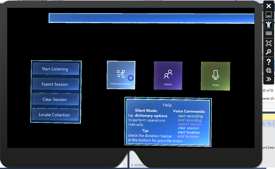
Some of the functionality, however, is accessed through 3D models that act like icons, since Mixed Reality is the perfect environment for having interactable objects instead of website type of buttons.
Text Overflow Handling
The prefab components that we used in our design, mentioned in the above section "UI Buttons and Panels", posssessed a built-in text component which, unfortunately, did not provide any support for handling text overflow. For the display of medical terms we decided to make use of Text Mesh Pro components (an imported library) that truncates the text according to the box size limits as the parent object collection required it. Explanations, however, demanded a different approach because it is important for the user to see all of the available information. Thus, we created an algorith for handling this issue.
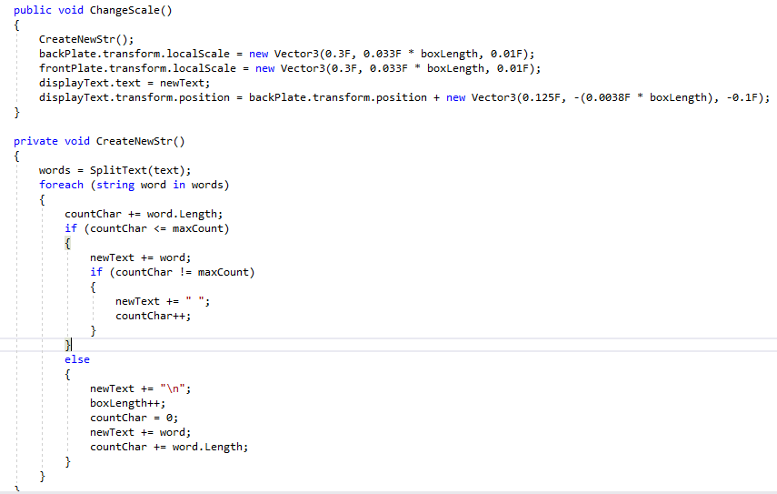
Firstly, after receiving the string by request to the Wikipedia API, it is split into lines according to a set limit for the number of characters allowed on a line. Then, the box size needed to be adjusted to the size of the text field. This was achieved by creating a prefab for the explanation box in the size of a single line. So, after splittig the string, the new text is assigned to a dynamically instantiated explanation box. Its size on the x axis is preset and the one on the y axis is calculated by multiplying the size for a single line by the number of lines in the string. Furthermore, the position of the textfield relative to the box had to be manually calibrated by multiplying by a constant to achive best results.
Object Collections
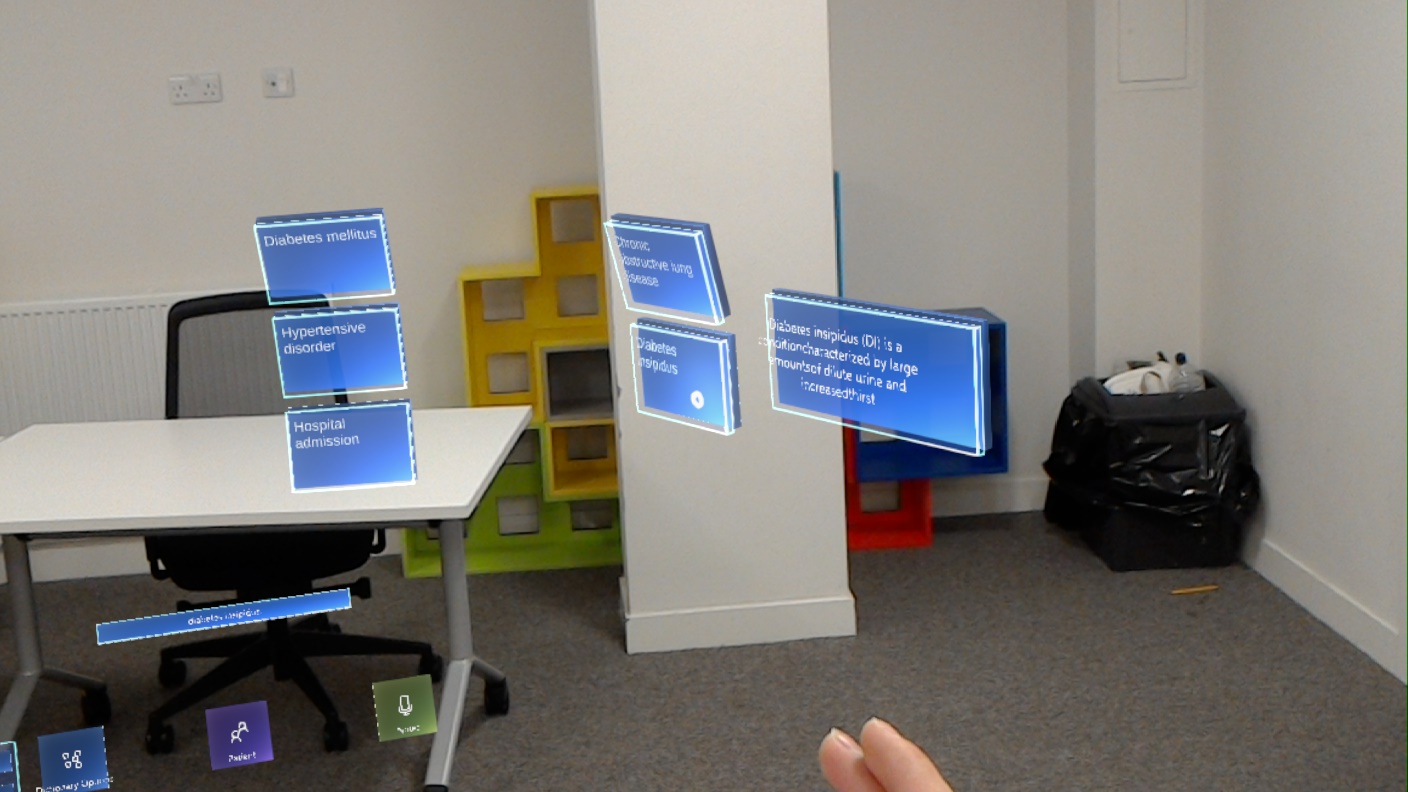
When dealing with multiple objects at a time, Object collections proved to be a valuable asset for this project. It is a way of sorting a group of objects in a number of ways: plane, sphere, cylinder, scatter, radial. When building the bar chart in the patient record the position of the separate bars is regulated by such Object Collection script as a plane. The medical terms extracted from speech in the dictionary scene are also placed in such collection but demonstrating the cylinder arrangement, which creates a curve by regulating the rotation too. This enhances the effect of dimension and actually makes the difference between the HoloLens and all other familiar devices when it comes to display of information.
Final Evaluation
In the context of the project’s requirements and the current stage of Mixed Reality design development, our front-end follows all the best practices, providing a fully immersive experience that is both exciting and easy to use, achieving the balance of dynamics and comfort.
References
- [1] Docs.microsoft.com. (2019). Design - Mixed Reality. [online] Available at: https://docs.microsoft.com/en-us/windows/mixed-reality/design [Accessed 10 Jan. 2019].
- [2] Docs.microsoft.com. (2019). Comfort - Mixed Reality. [online] Available at: https://docs.microsoft.com/en-us/windows/mixed-reality/comfort [Accessed 10 Jan. 2019].
- [3] Docs.microsoft.com. (2019). Gaze targeting - Mixed Reality. [online] Available at: https://docs.microsoft.com/en-us/windows/mixed-reality/gaze-targeting [Accessed 10 Jan. 2019].
- [4] Docs.microsoft.com. (2019). Interactable object - Mixed Reality. [online] Available at: https://docs.microsoft.com/en-us/windows/mixed-reality/interactable-object [Accessed 10 Jan. 2019].
- [5] Docs.microsoft.com. (2019). Spatial Mapping Design - Mixed Reality. [online] Available at: https://docs.microsoft.com/en-us/windows/mixed-reality/spatial-mapping-design [Accessed 10 Jan. 2019].